About
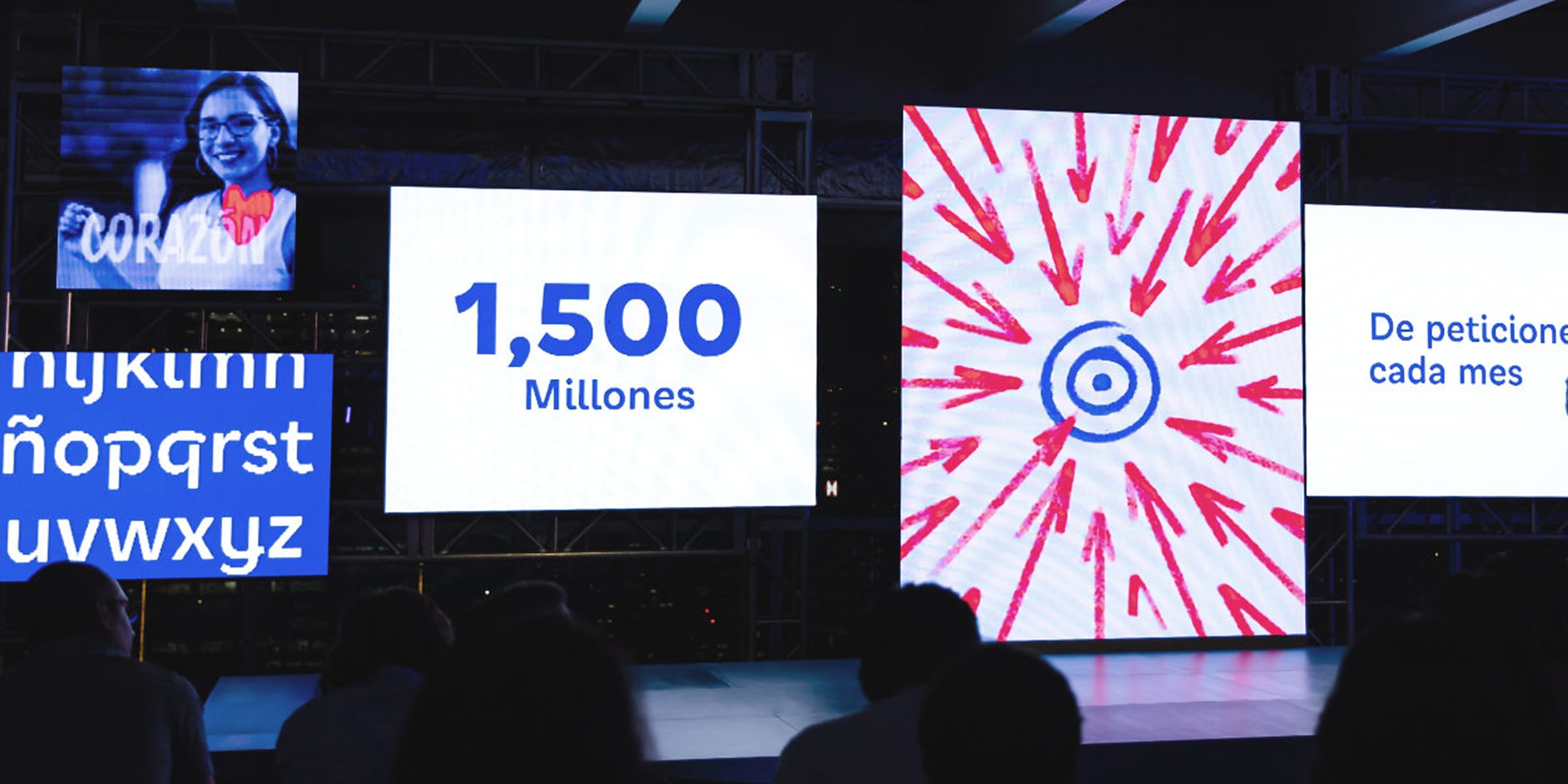
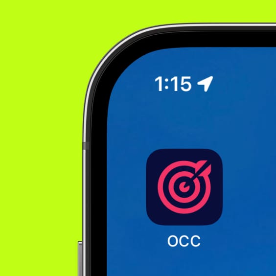
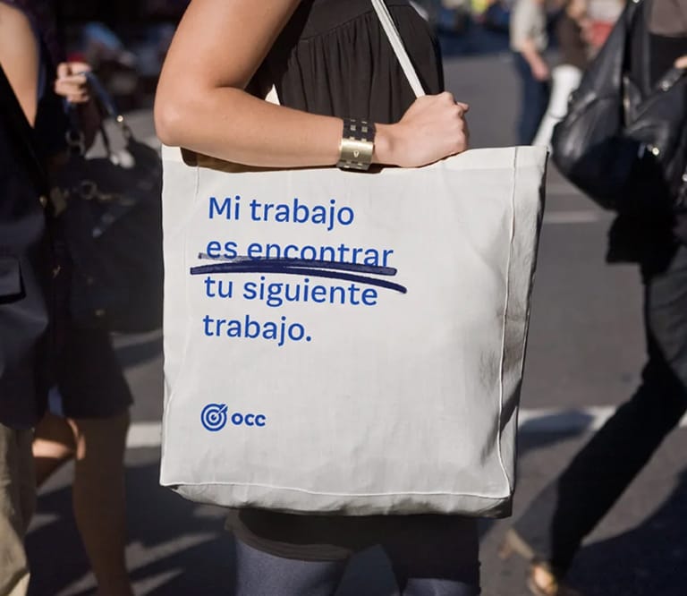
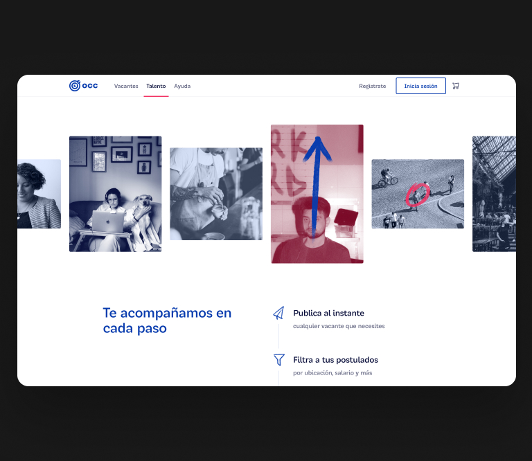
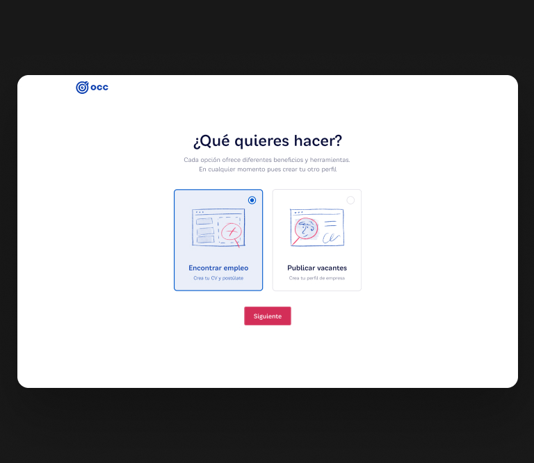
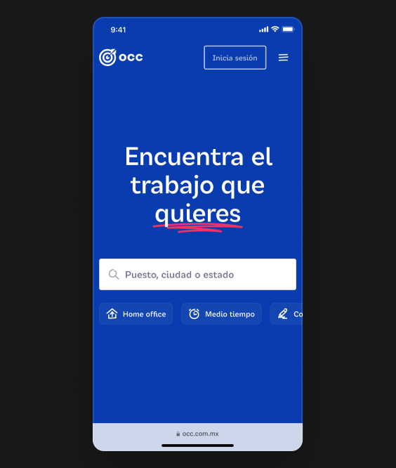
OCC is Mexico’s leading job board, connecting millions of professionals with job opportunities across the country. Following a recent rebrand, the challenge was to translate the new visual identity into a consistent and scalable product experience.
The project focused on implementing the updated branding across the digital platform and building a design system powered by tokens to support long-term growth and design consistency.
Credits
Brand: Enigma
Visual Design: Guillermo González, Montserrat Cosme, Nayely Sánchez
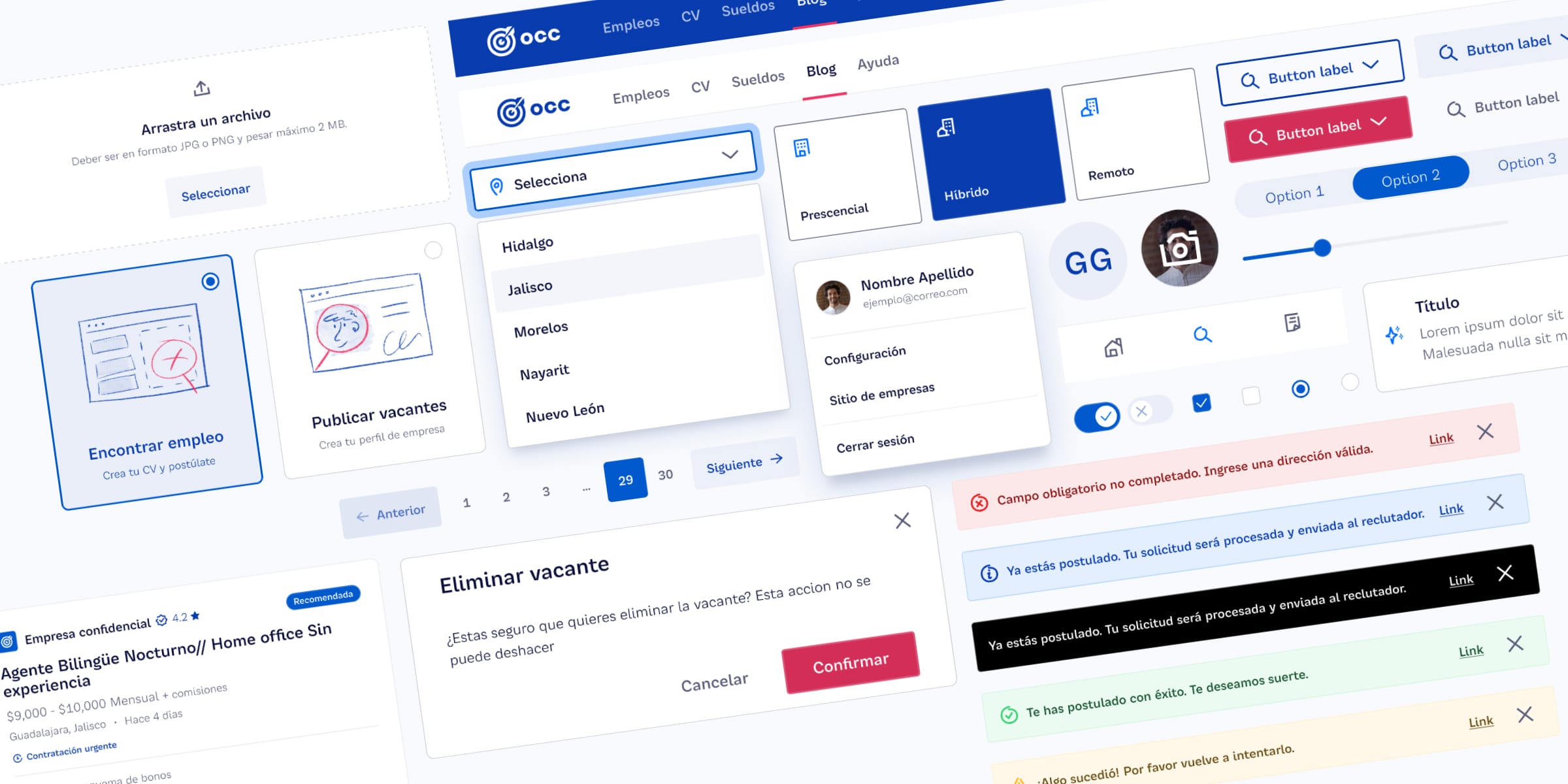
The project aimed to address several key challenges faced by the company's digital presence. The old website needed a significant refresh to align with the company's new brand identity. The existing design system was outdated, lacked accessibility compliance, and had numerous inconsistencies across components. These issues impacted both the user experience and the efficiency of design and development workflows.
Accessibility
One of the core challenges was ensuring that the product met accessibility standards. This involved revisiting existing UI components and workflows to make them compliant with WCAG guidelines, such as sufficient color contrast, screen reader compatibility, and keyboard navigation support.
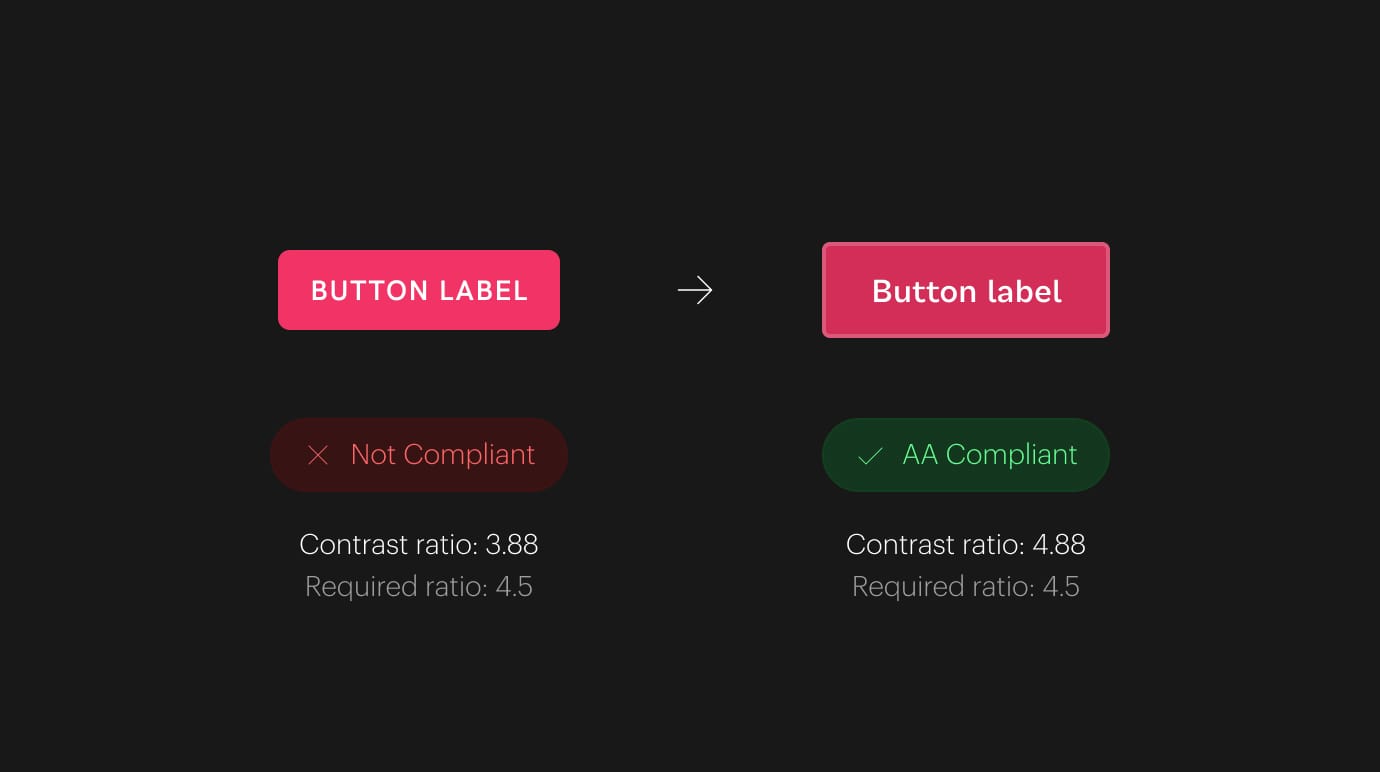
Most components in the previous design system were not accessible, primarily due to insufficient color contrast. Additionally, none of the components included focus states for keyboard navigation, and touch targets were too small, making them unsuitable for mobile devices.
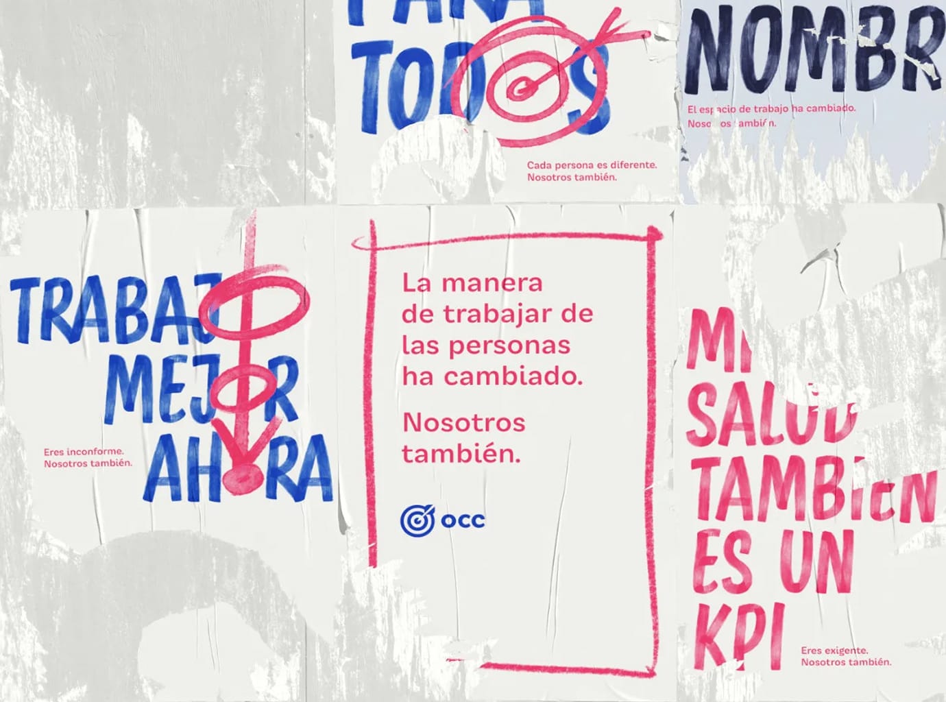
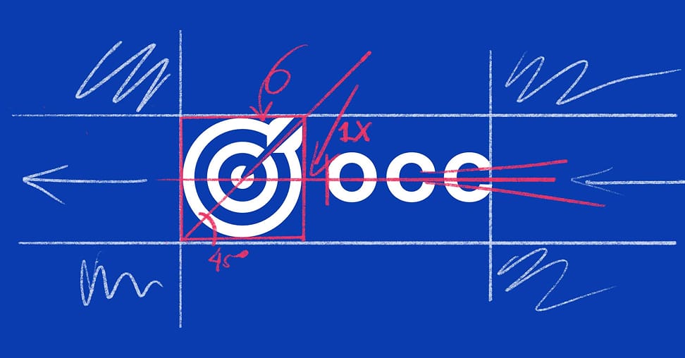
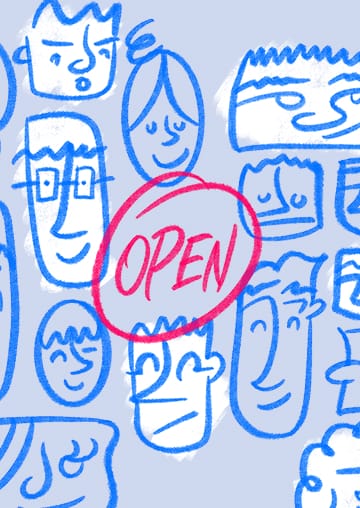
Rebranding
The company underwent a comprehensive rebranding initiative, requiring the entire design system to be updated to reflect the new brand identity. This included redefining typography, color palettes, and visual styles, ensuring a seamless transition across all digital products.
Consistency
Maintaining visual and functional consistency was another challenge. Many components had been created ad-hoc over time, leading to inconsistencies and inefficiencies. A systematic approach was required to streamline the design and development process.
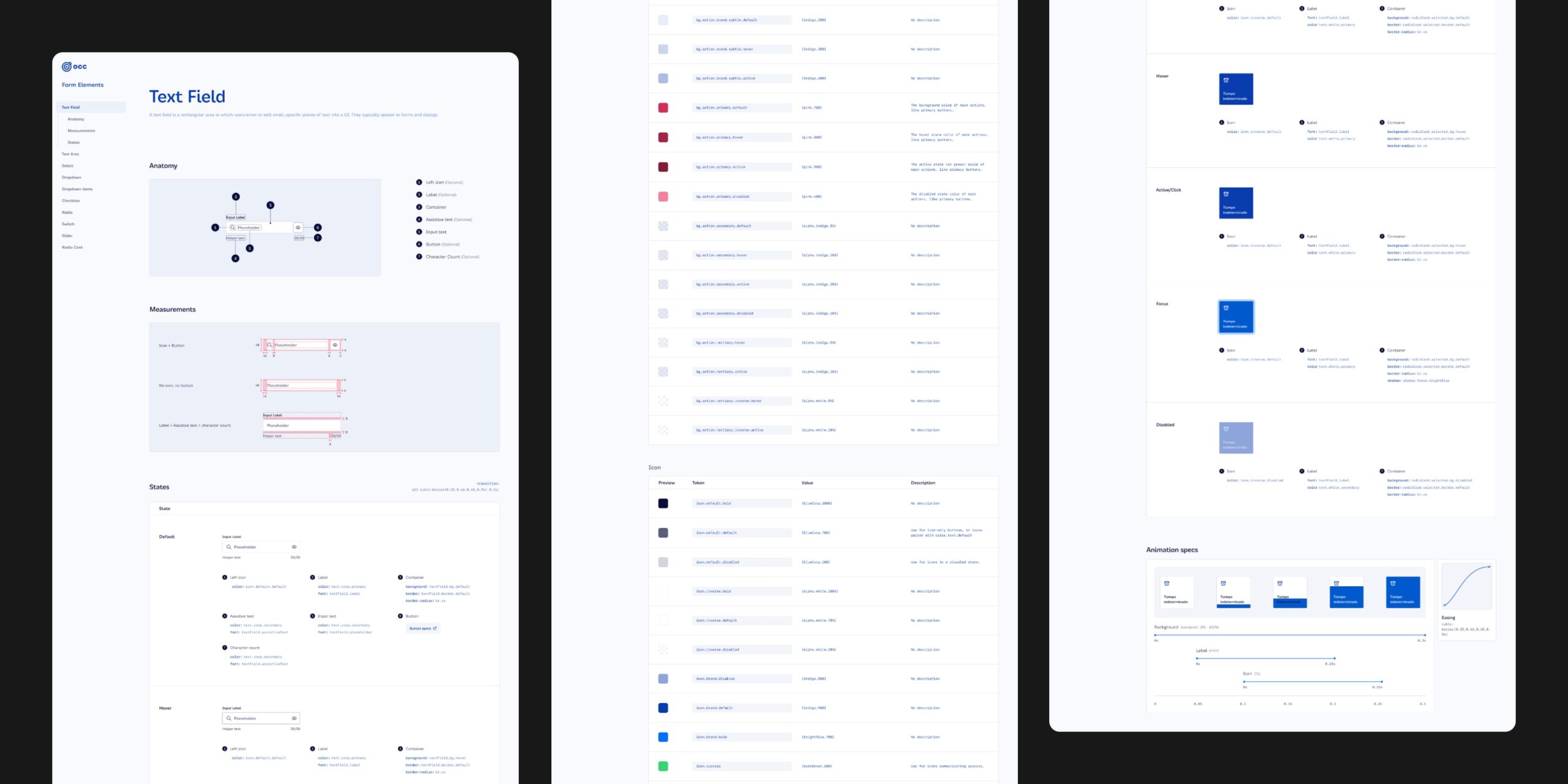
Token structure
The design system was built using a tokenized structure that ensured scalability and consistency across the product.
It started with base tokens, which defined core values like typography scales, spacing, and brand colors. These were mapped to semantic tokens, representing design intents such as primary, secondary, and inverse. Component tokens were then created by referencing semantic tokens, allowing for precise styling of individual components while maintaining adaptability.
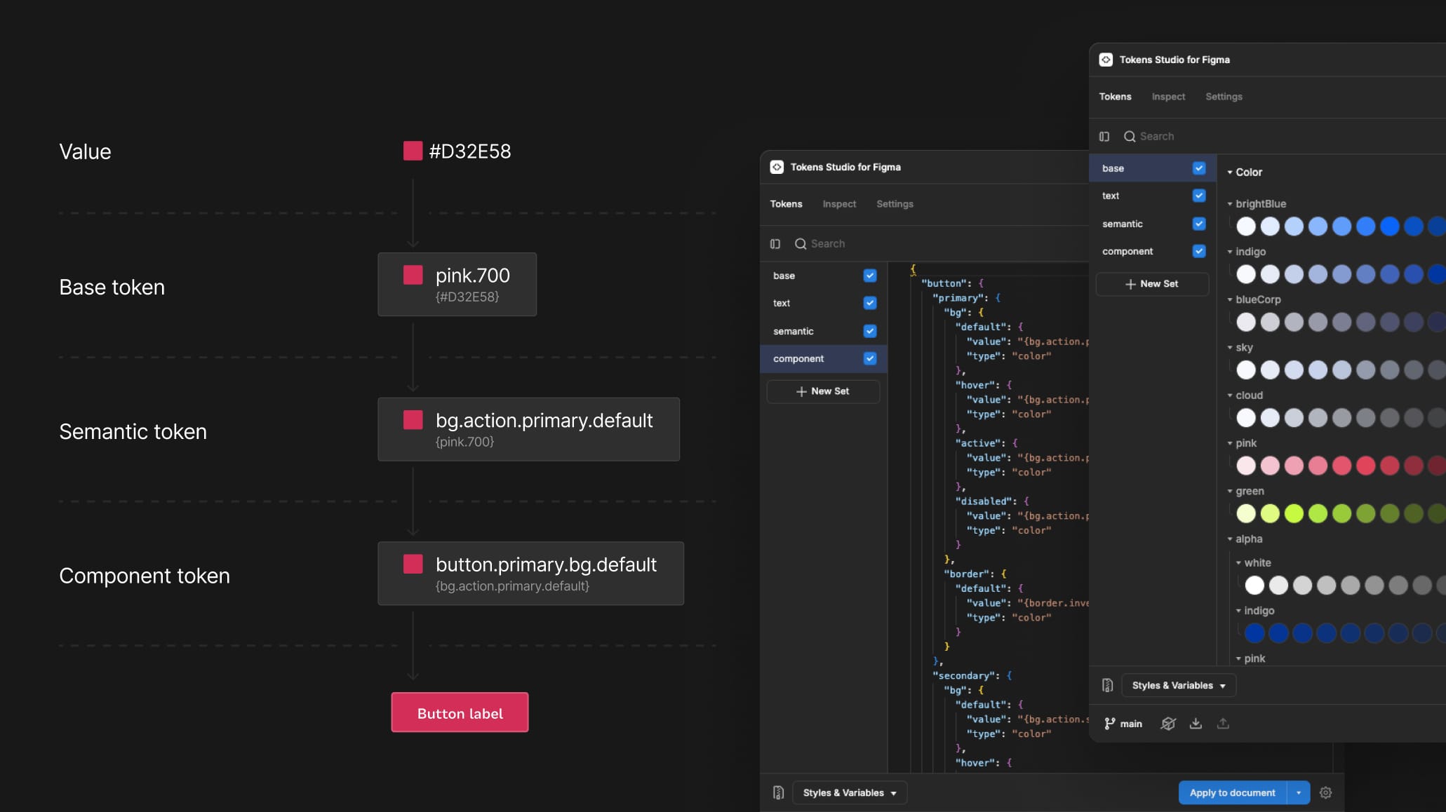
To streamline updates and maintain alignment between design and development, we integrated Token Studio with GitHub. This connection enabled direct synchronization of design tokens from Figma to the codebase, reducing manual processes and ensuring consistent implementation across all platforms.
Documentation
Comprehensive documentation was created to support adoption and onboarding. Each component and token was thoroughly documented with guidelines on usage and accessibility considerations.